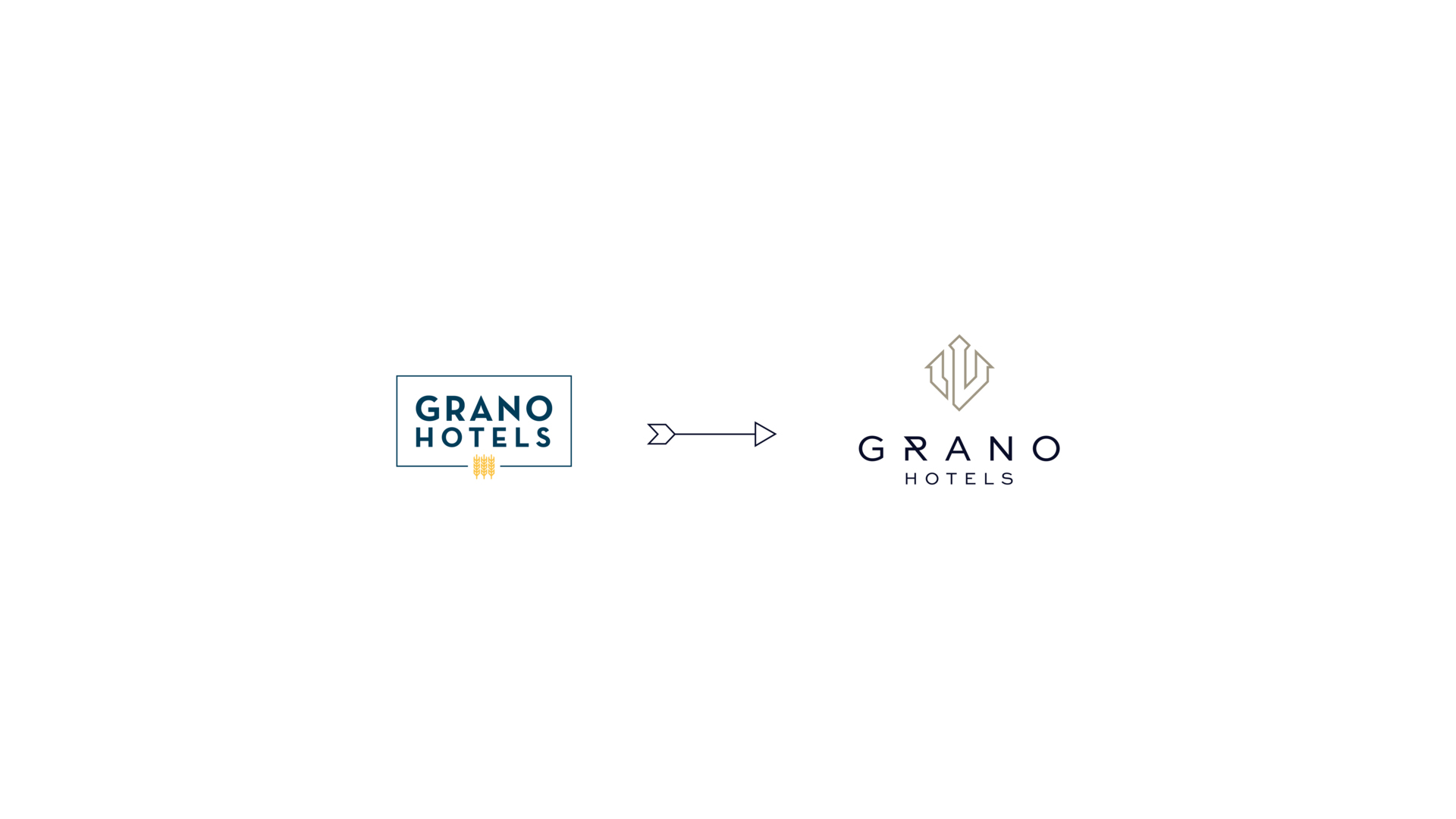
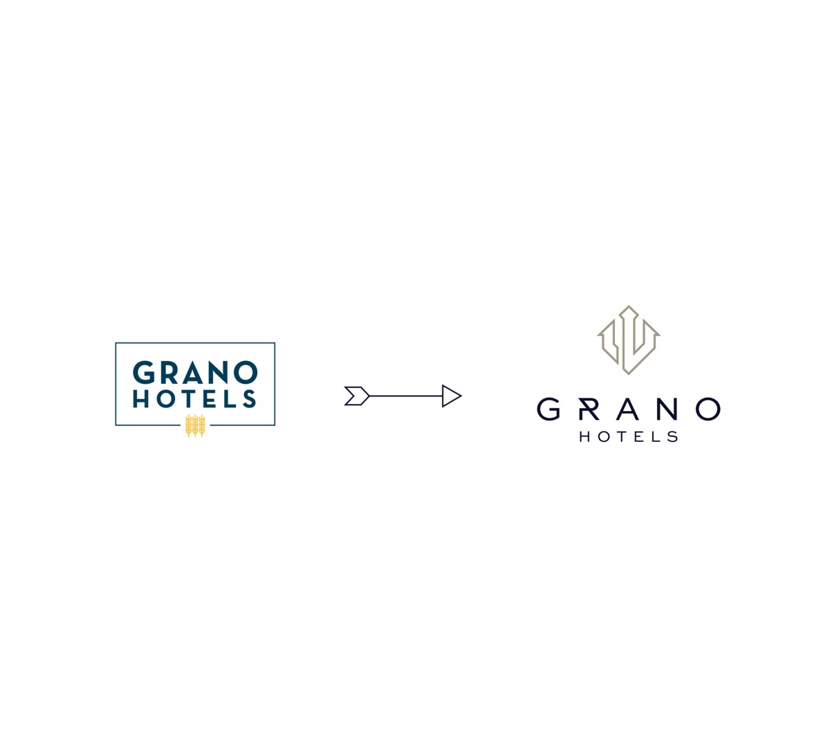
Markenrelaunch
Das Rebranding von Grano Hotels ist eine natürliche Weiterentwicklung der Marke, die aus ihrer dynamischen Entwicklung und Expansion resultiert. Ziel ist es, das Erscheinungsbild aller Einrichtungen unter einer einheitlichen, erkennbaren Premium-Marke zu vereinheitlichen. Mit der neuen visuellen Identifikation betonen wir gemeinsame Werte: Komfort, Servicequalität und die einzigartige Atmosphäre jedes Hotels.
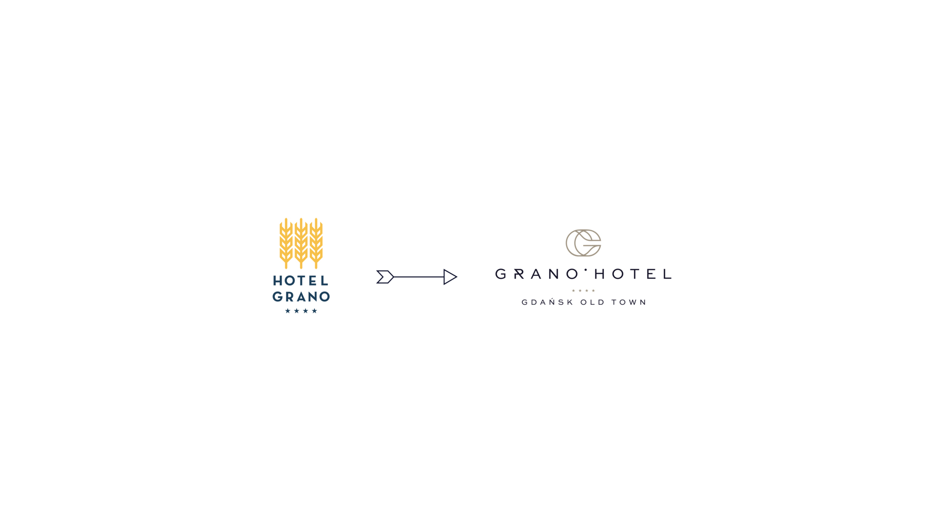
Im Rahmen des Rebrandings ändern sich die Logos und Namen unserer Einrichtungen, was es uns ermöglicht, deren Zugehörigkeit zu einer einheitlichen Marke Grano Hotels noch besser hervorzuheben.
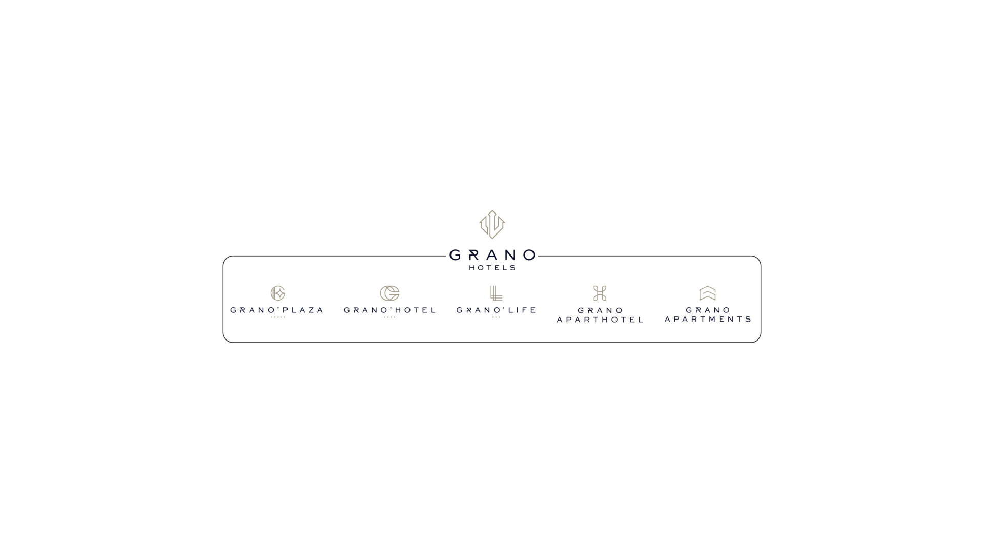
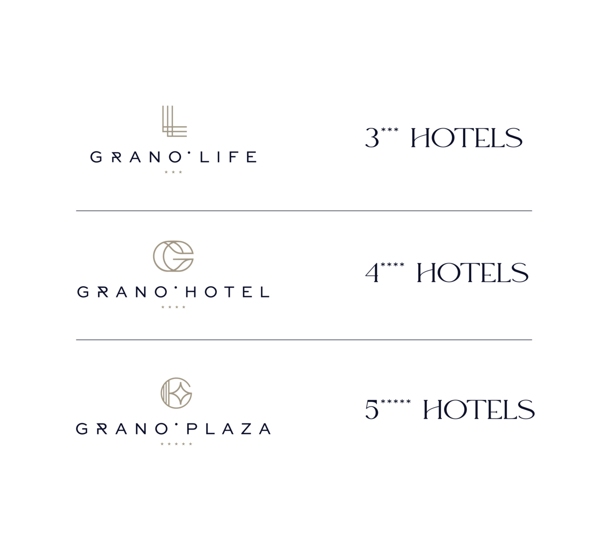
GRANO HOTELS MARKEN
- GRANO LIFE*** — DREI-STERNE-HOTELS
- GRANO HOTEL**** — VIER-STERNE-HOTELS
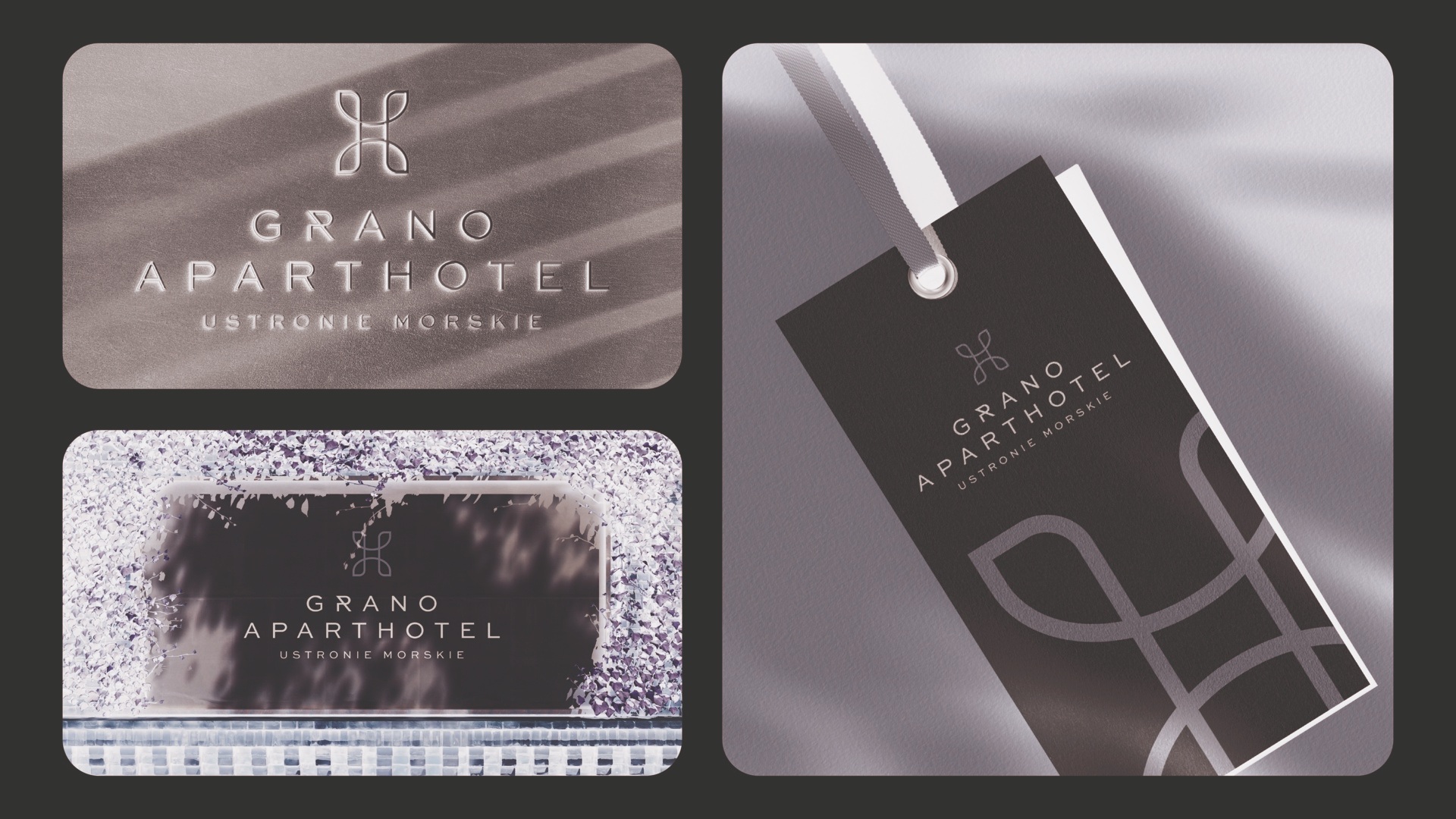
- GRANO PLAZA***** — FÜNF-STERNE-HOTELS


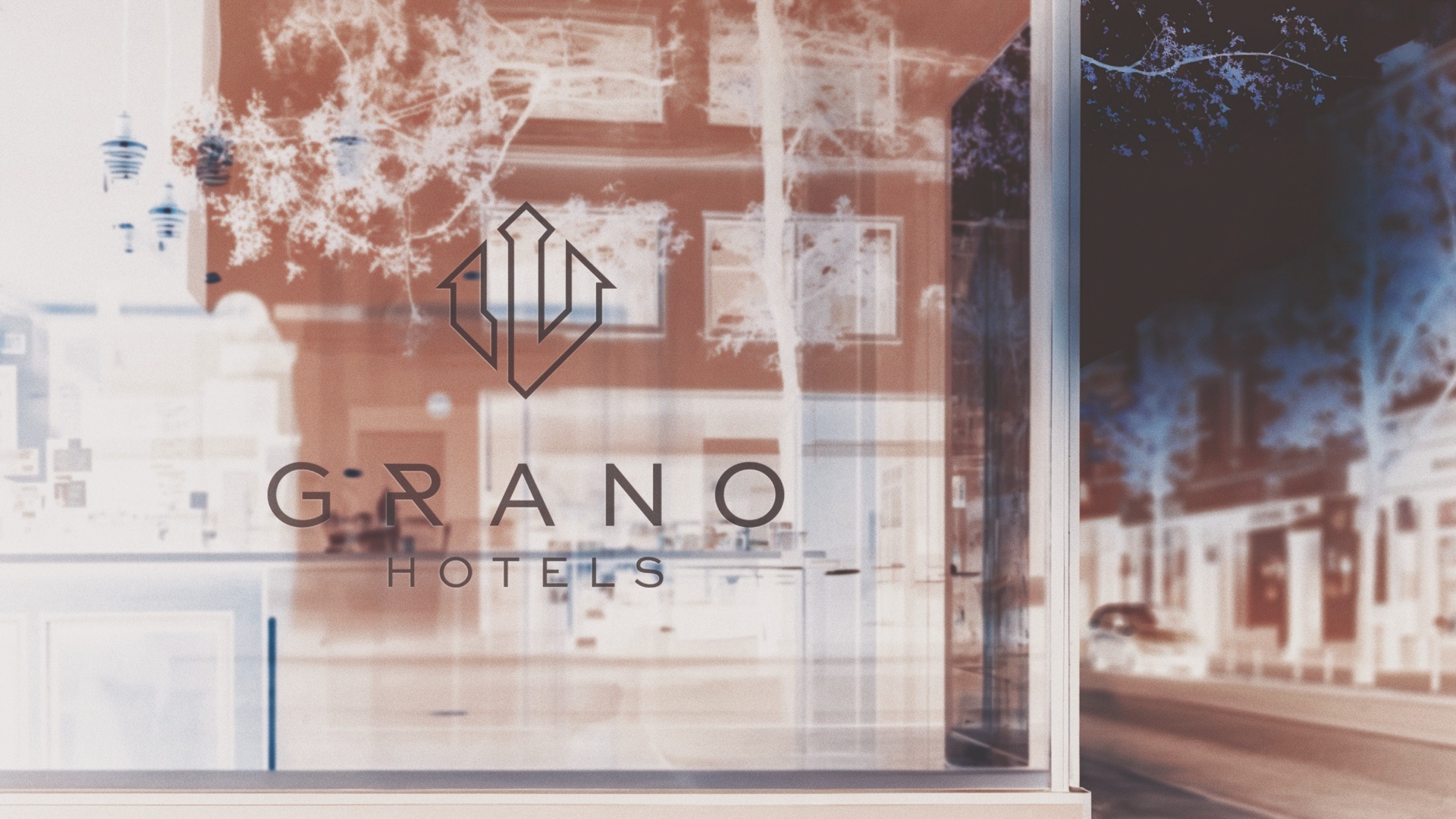
NEUES GRANO HOTELS LOGO
Die Farben des Logos verbinden die goldenen Sandtöne – ein Symbol für Wohlstand und feste Grundlagen – mit dem tiefen Blau der Meereswellen, das die Verbindung von Land und Wasser, Ort und Erlebnis widerspiegelt. Diese Elemente erinnern uns an die Harmonie der Natur, auf der die Philosophie der Grano Hotels basiert: eine Oase der Ruhe im Herzen der Stadt, wo jedes Detail an die Verbundenheit mit der Geschichte von Danzig und seiner Seele des Meeres erinnert.
GRANO HOTELS SIGNET
Danzig, die Stadt des Neptun, zieht seine Kraft aus dem Meer. Deshalb ist das zentrale Element des Logos von Grano Hotels das Symbol des Meeresgottes – Neptun. Es handelt sich jedoch nicht um eine traditionelle, monumentale Figur, sondern um eine moderne, subtile Interpretation. Das Symbol Neptuns zeigt seinen Dreizack – ein Zeichen von Macht und Harmonie – eingebettet in elegante, wellenförmige Linien, die auf das Meer verweisen. Das Dreizack-Motiv wird auch zur Metapher für die drei Säulen der Marke: Luxus, Gastfreundschaft und Authentizität.
Die Farben des Logos verbinden goldene Sandtöne – ein Symbol für Reichtum und solide Grundlagen – mit dem tiefen Blau der Meereswellen, das die Verbindung von Land und Wasser, Ort und Erlebnis widerspiegelt. Diese Elemente erinnern an die Harmonie der Natur, auf der die Philosophie von Grano Hotels basiert: eine Oase der Ruhe im Herzen der Stadt, wo jedes Detail an die Verbindung zur Geschichte von Danzig und seiner Meeresseele erinnert.

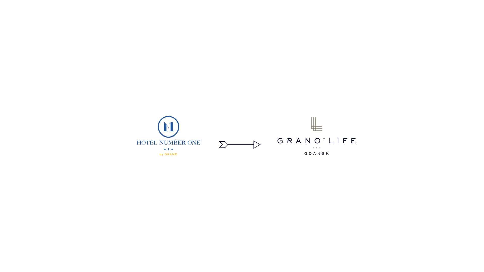
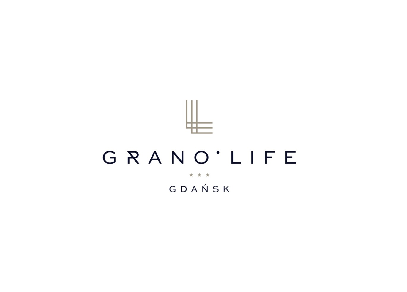
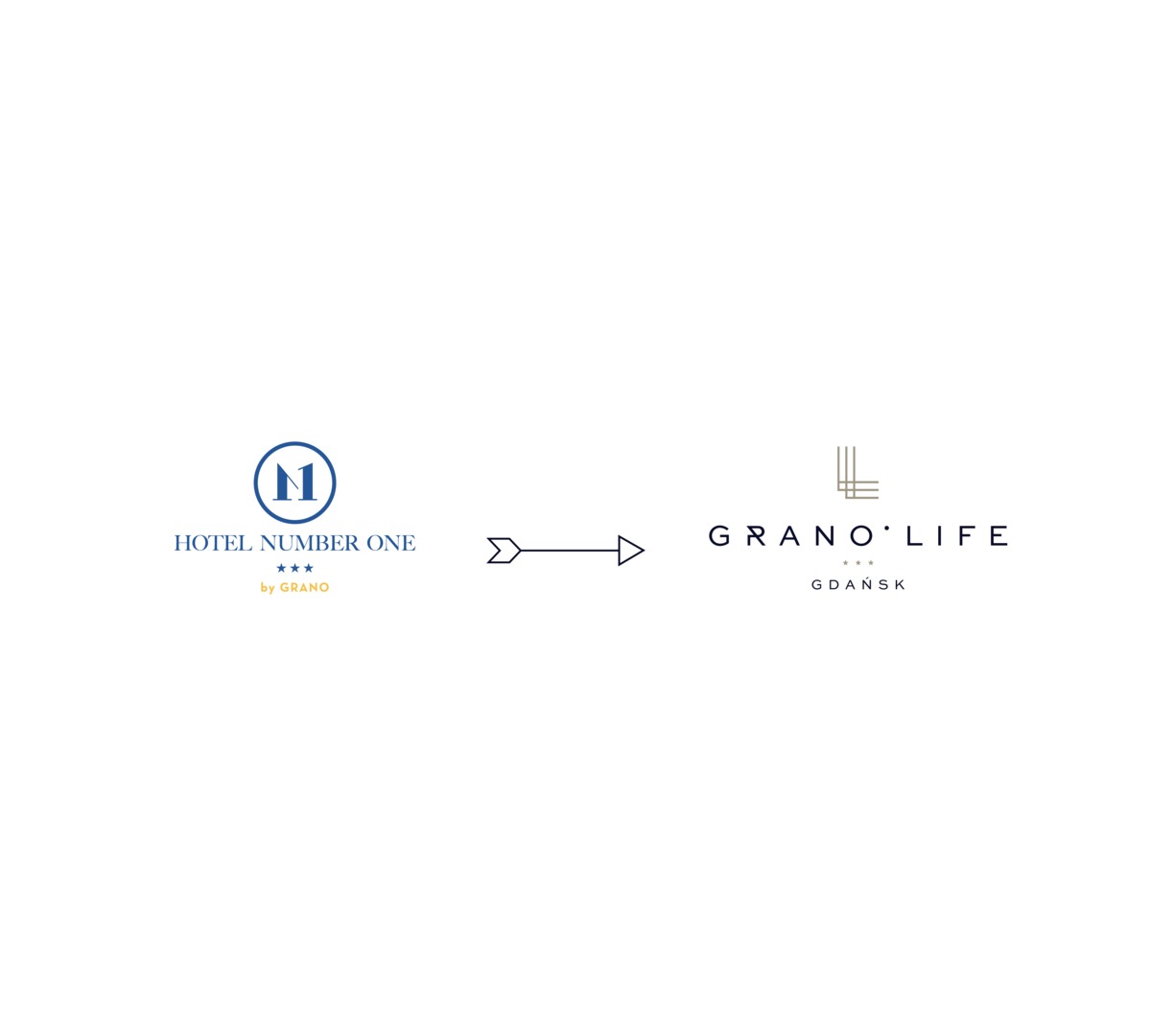
hotel nummer eins von grano
bald: grano life*** gdańsk
Grano Life ist die Essenz des urbanen Lebensstils in einer zugänglichen, modernen Form. Es ist ein Drei-Sterne-Hotel, das Funktionalität, Ästhetik und Komfort vereint und so einen idealen Raum sowohl für Geschäftsreisende als auch für diejenigen schafft, die sich unter komfortablen Bedingungen entspannen möchten.
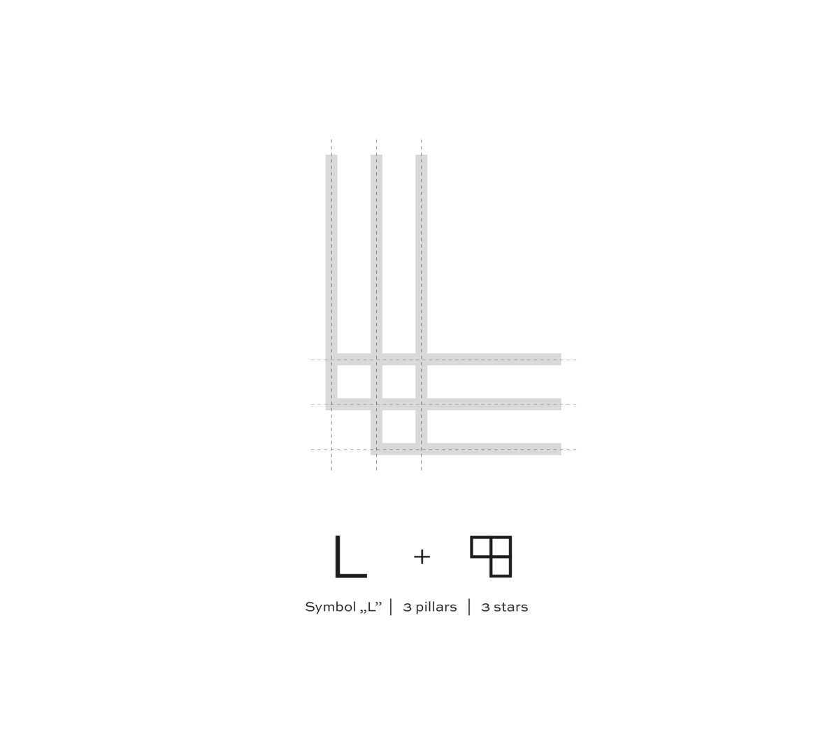
GRANO LIFE*** SIGNET
Horizontale und vertikale Linien können einem Stadtplan ähneln, der eine großartige Lage und einfachen Zugang zu städtischen Attraktionen symbolisiert. Dies ist ein Hotel für diejenigen, die nahe am Zentrum des Geschehens sein möchten, aber gleichzeitig eine gemütliche Atmosphäre und Komfort schätzen.
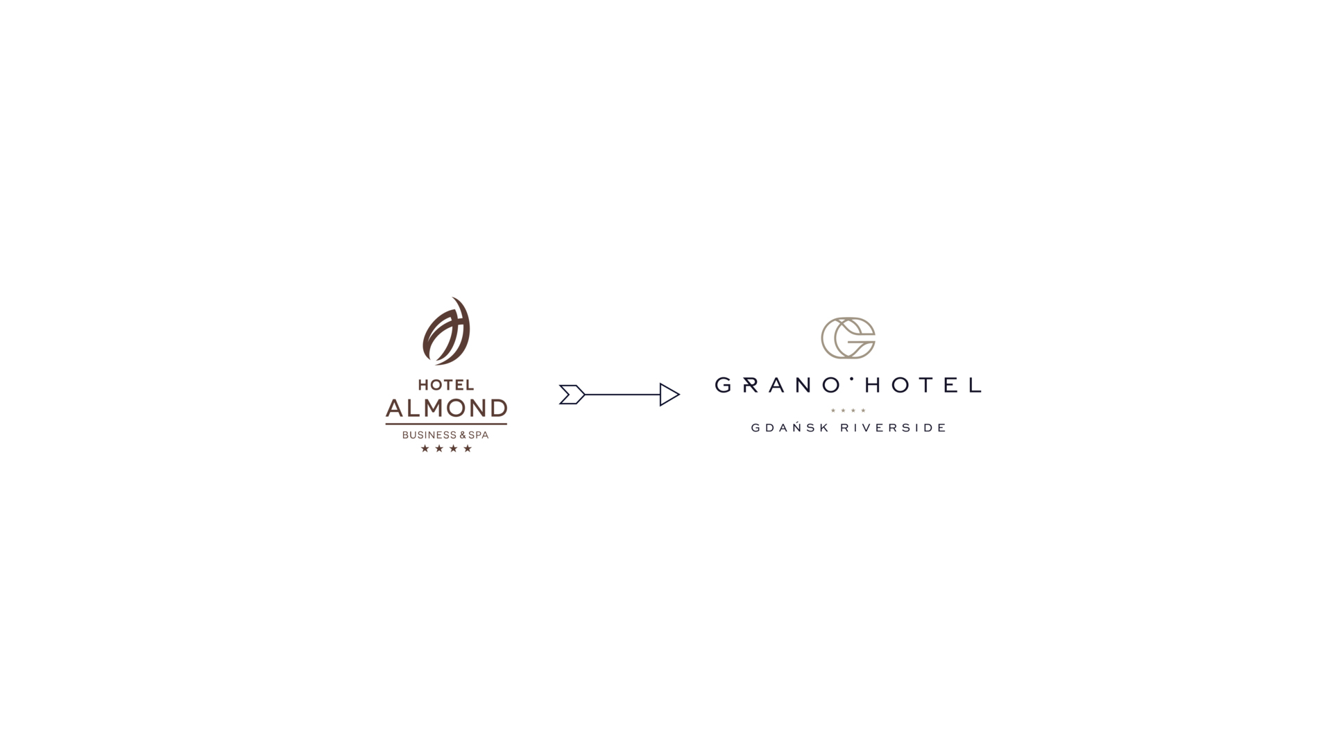
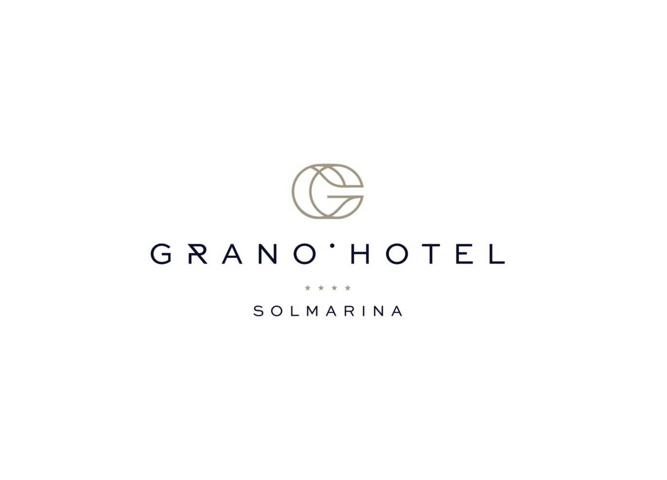
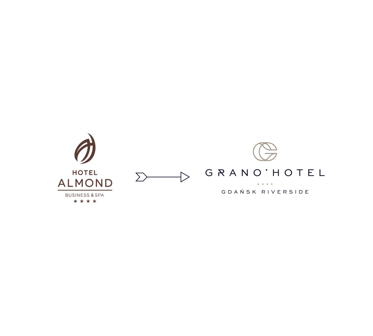
hotel almond business & spa
bald: grano hotel**** gdańsk riverside
Das Grano Hotel ist mehr als nur ein Ort zum Übernachten – es ist ein Lebensstil für diejenigen, die Komfort, lokalen Charakter und höchsten Service erwarten – egal ob auf Geschäftsreise oder einem entspannenden Stadtaufenthalt.
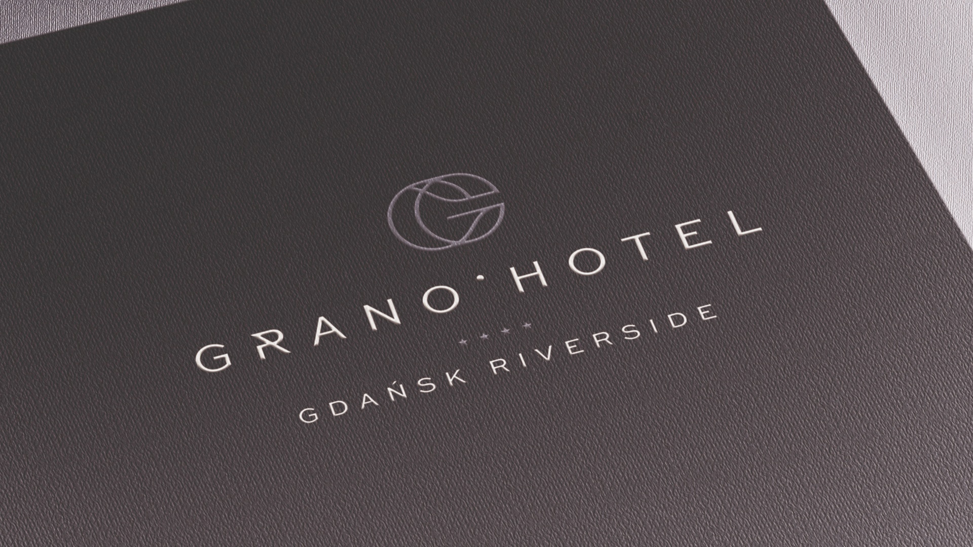
grano hotel**** SIGNET
Das Signet des Grano Hotels ist eine moderne Interpretation des Buchstabens "G", eingebettet in einen harmonischen Kreis - ein Symbol für Vollständigkeit, Gastfreundschaft und Komfort. Verschlungene Linien spiegeln das Gleichgewicht zwischen Eleganz und Funktionalität wider und schaffen ein stimmiges Ganzes, das Aufmerksamkeit erregt und im Gedächtnis bleibt. Es ist ein Zeichen, das von einem Hotel erzählt, bei dem jedes Detail zählt und die Gäste stets im Mittelpunkt stehen.

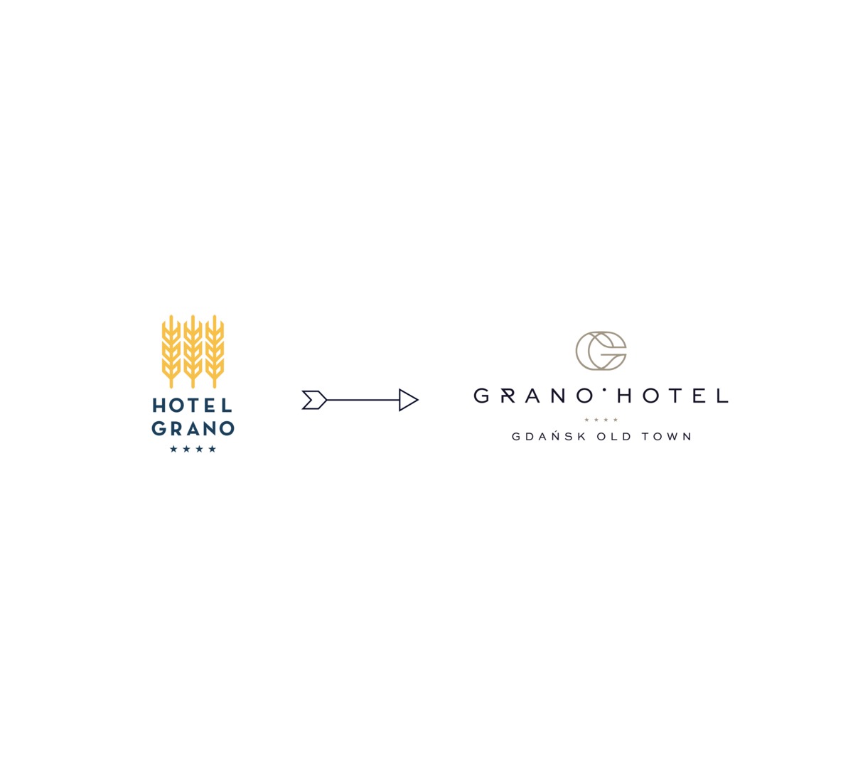
hotel grano gdańsk altstadt
bald: grano hotel**** gdańsk altstadt
Das Grano Hotel ist mehr als nur ein Ort zum Übernachten – es ist ein Lebensstil für diejenigen, die Komfort, lokalen Charakter und den höchsten Servicestandard erwarten – egal ob auf Geschäftsreise oder bei einem entspannten Städtetrip.
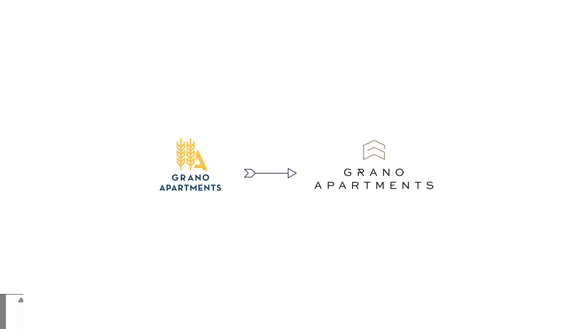
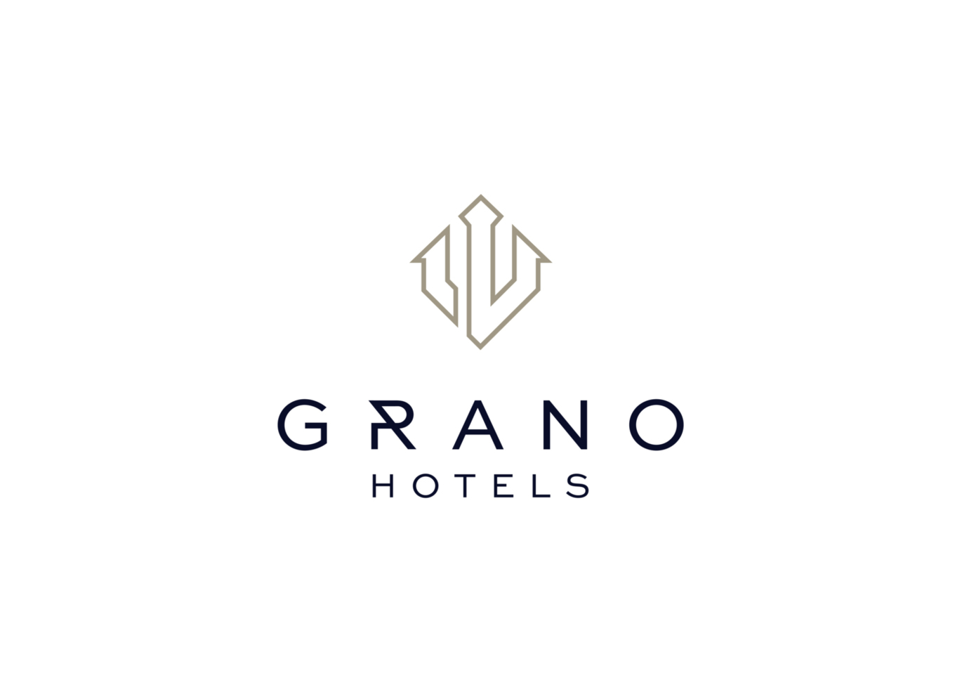
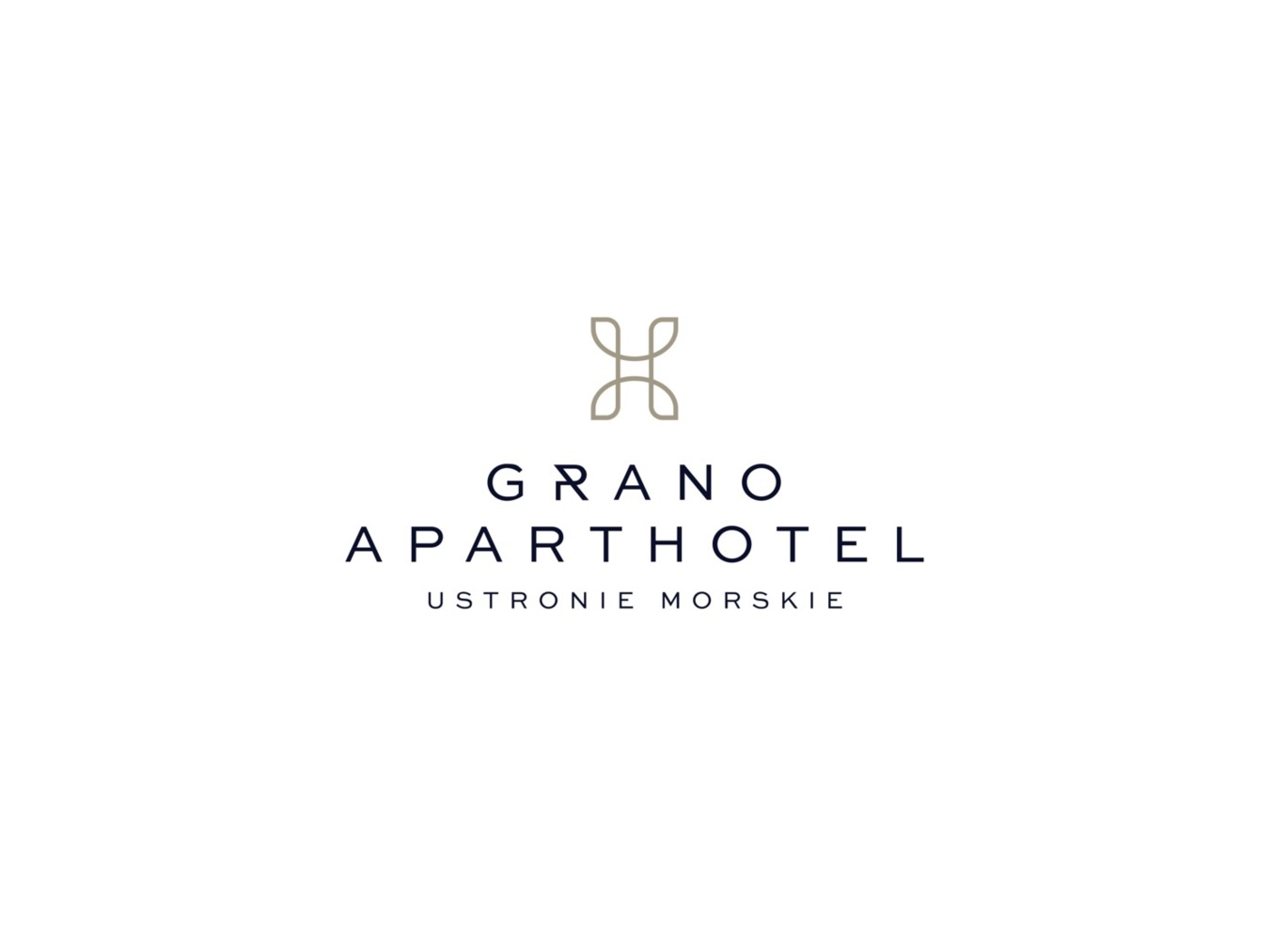
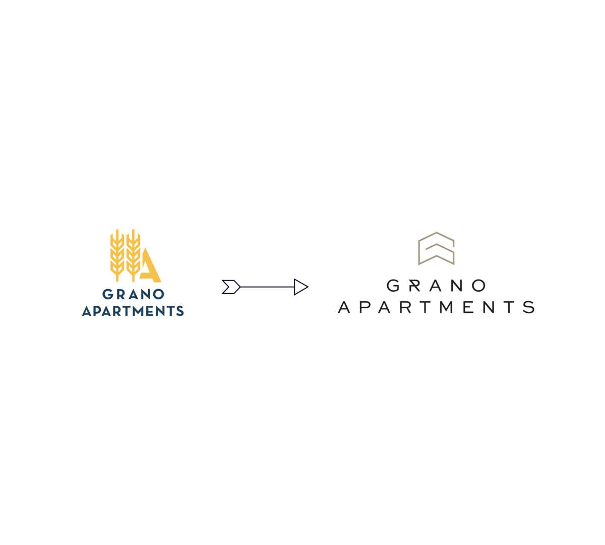
neues grano apartments logo
Grano Apartments ist eine Premium-Apartmentmarke, die die Unabhängigkeit eines Aufenthalts mit dem Komfort von Hotelausstattungen verbindet. Stilvolle Inneneinrichtungen, funktionale Räume und ausgezeichnete Lagen machen Grano Apartments zur perfekten Wahl für Kurz- und Langzeitaufenthalte – für Familien, Paare und Geschäftsreisende. Es ist Freiheit, Komfort und Qualität, die einen einzigartigen Ort zum Leben und Entspannen schaffen.
Grano Apartments:
- Grano Apartments Gdańsk Altstadt (bald Grano Apartments Gdańsk Residence)
- Grano Apartments Gdańsk Granaria
- Grano Apartments Gdańsk Nowa Motława (bald Grano Apartments Gdańsk Motława)
- Grano Apartments Solmarina
grano apartments SIGNET
Das Dach ist ein universelles Symbol für Schutz und Stabilität – zwei Schlüsselwerte, die Grano Apartments definieren. Seine Linien verbergen einen durchdachten Raum, der Funktionalität mit Ästhetik verbindet. Es ist mehr als nur ein Ort zum Übernachten – es ist ein Raum zum Leben und Ausruhen, in dem sich jeder Gast wie zu Hause fühlen kann.
Die geometrische, einfache Form des Signets spiegelt den Geist der modernen Architektur wider und verweist auf die eleganten und stilvollen Innenräume der Apartments. Die klare, harmonische Linie betont den hohen Standard, Komfort und die verfeinerten Details, die die Marke von der Konkurrenz unterscheiden.

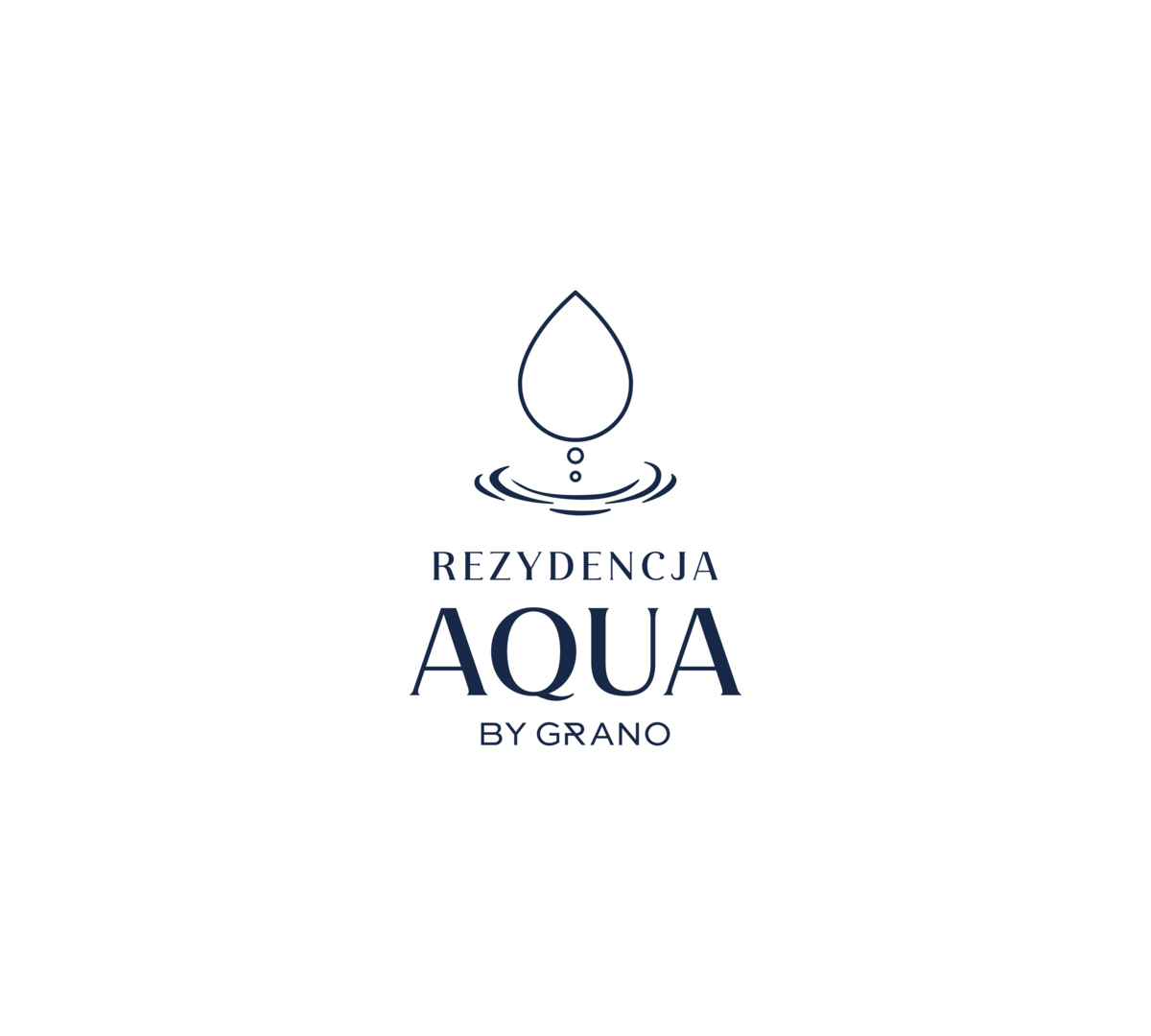
EINZELMARKE
- Residenz AQUA von GRANO